Kandu App First Time User Experience
Project Description
My goal was to create an experience for stroke survivors to get familiar with the Kandu app more easily and empower more self service of getting onto the app. Our user base has a lower familiarity with technology so this was an important feature to do effectively.
The previous experience did a lot of telling vs. showing, so I looked to make this a more interactive experience to reverse that paradigm and introduce the app features and navigation in context.
Role
I was the sole designer on this project, completing the design work from ideation through implementation oversight.
Discovery/Research Phase
Evaluating the Experience
I started the project with interviews with our Customer support specialists who onboarded users and introduced them to the app. These interviews were useful not only to gain insights to improve the onboarding they would conduct, but also to allow users to get onto the app on their own without needing their walkthroughs.
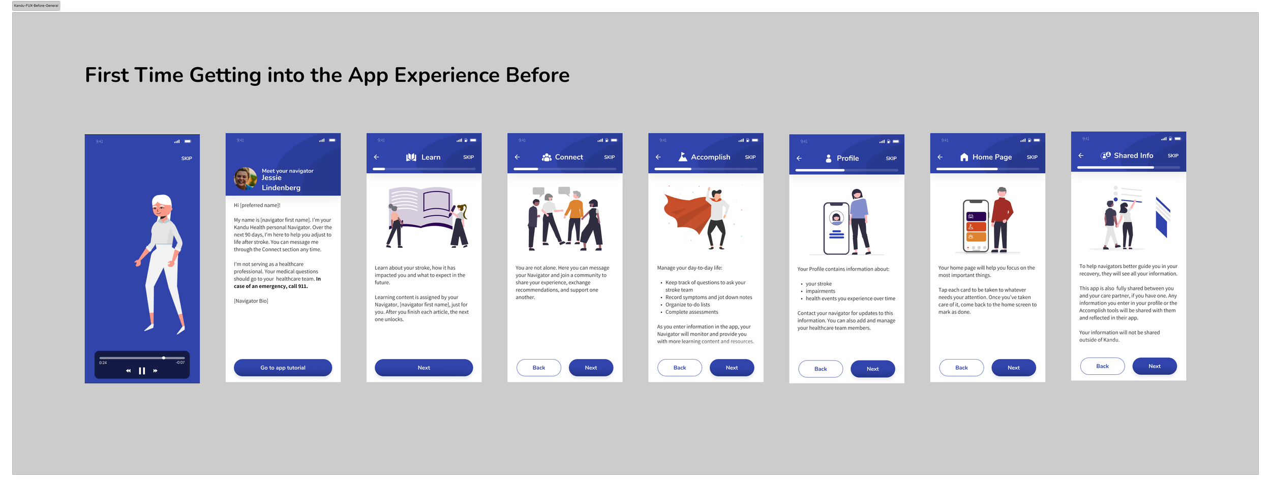
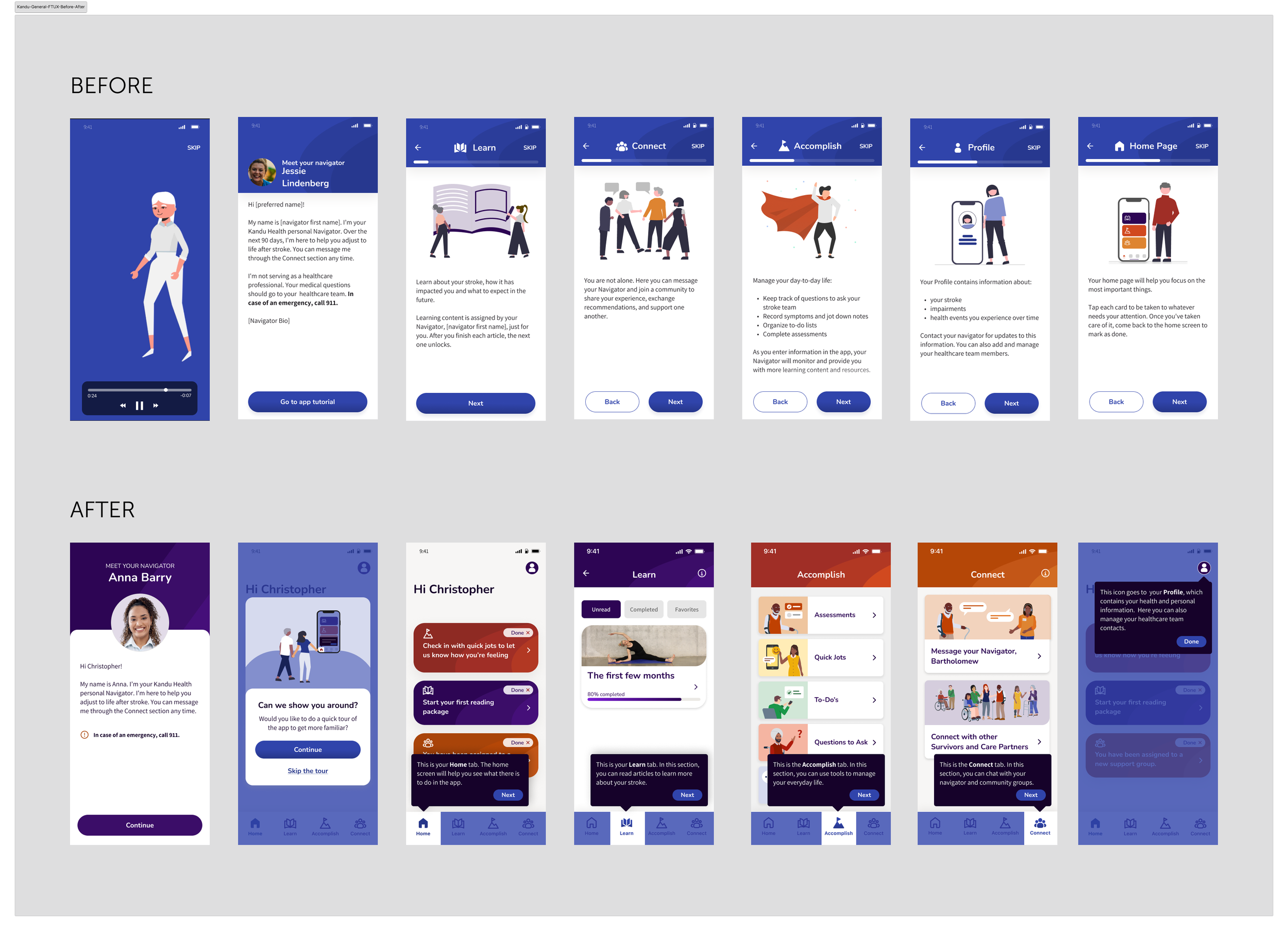
Before getting into the app for the first time, there was a general tour experience, with a video that was usually skipped and a series of screens up front which were not very useful, as they were separated from the screens they talked about and did not show images of the screens. Those who were onboarding users would often need to walk through the app afterward to introduce the app in the real context of the screens in addition to this, which was difficult to do over the phone without being able to view where the users were in the app. Sometimes they would skip through them to get into the app.
First Time Getting Into the App Experience Before
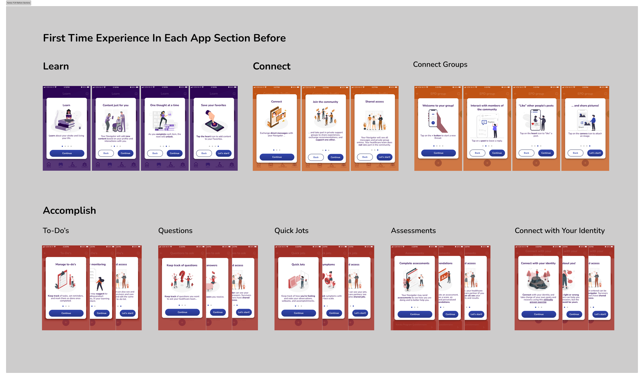
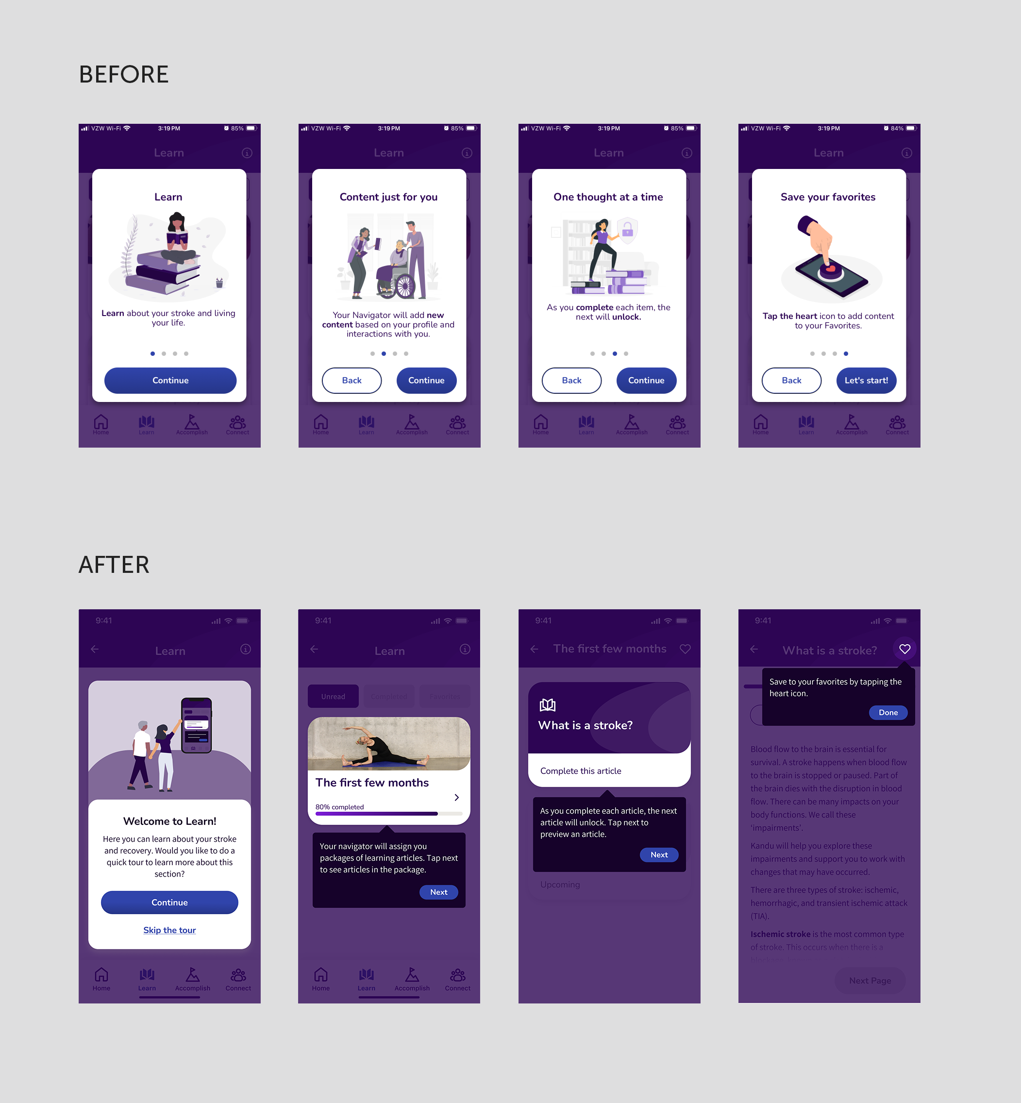
Each section of the app had a series of modals the first time the users entered. These would be skipped through without reading the modals to get into the sections.
Speaking with customer support validated my ideas for improvement to get the users into the app more quickly and introduce areas as they come up in context, vs having disconnected information up front.
Competitive Analysis
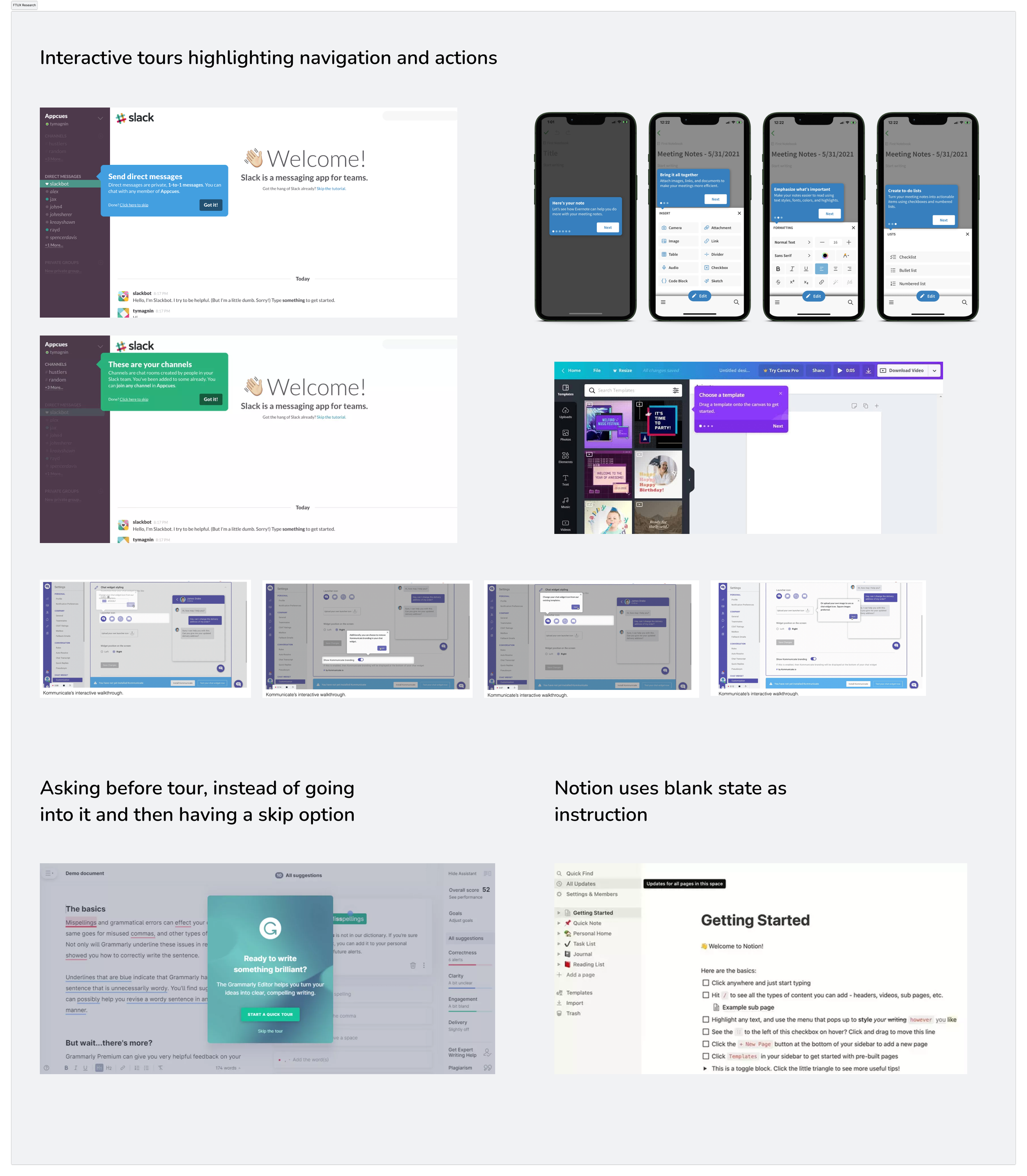
Having a user validated direction, I did research on other first time user experiences & product tours, identifying effective patterns for a more interactive first time experience.
Overall Product Tour Redesign
The previous experience directed the user through a number of screens before getting into the app. The purpose of these were to introduce sections of the app, however it did not show these sections. This was often skipped.
There was also a video that was often skipped and seemed misplaced in the app; it didn’t show the actual app screens and talked about the program. I recommended on moving this out and using it for marketing purposes before getting into the app.
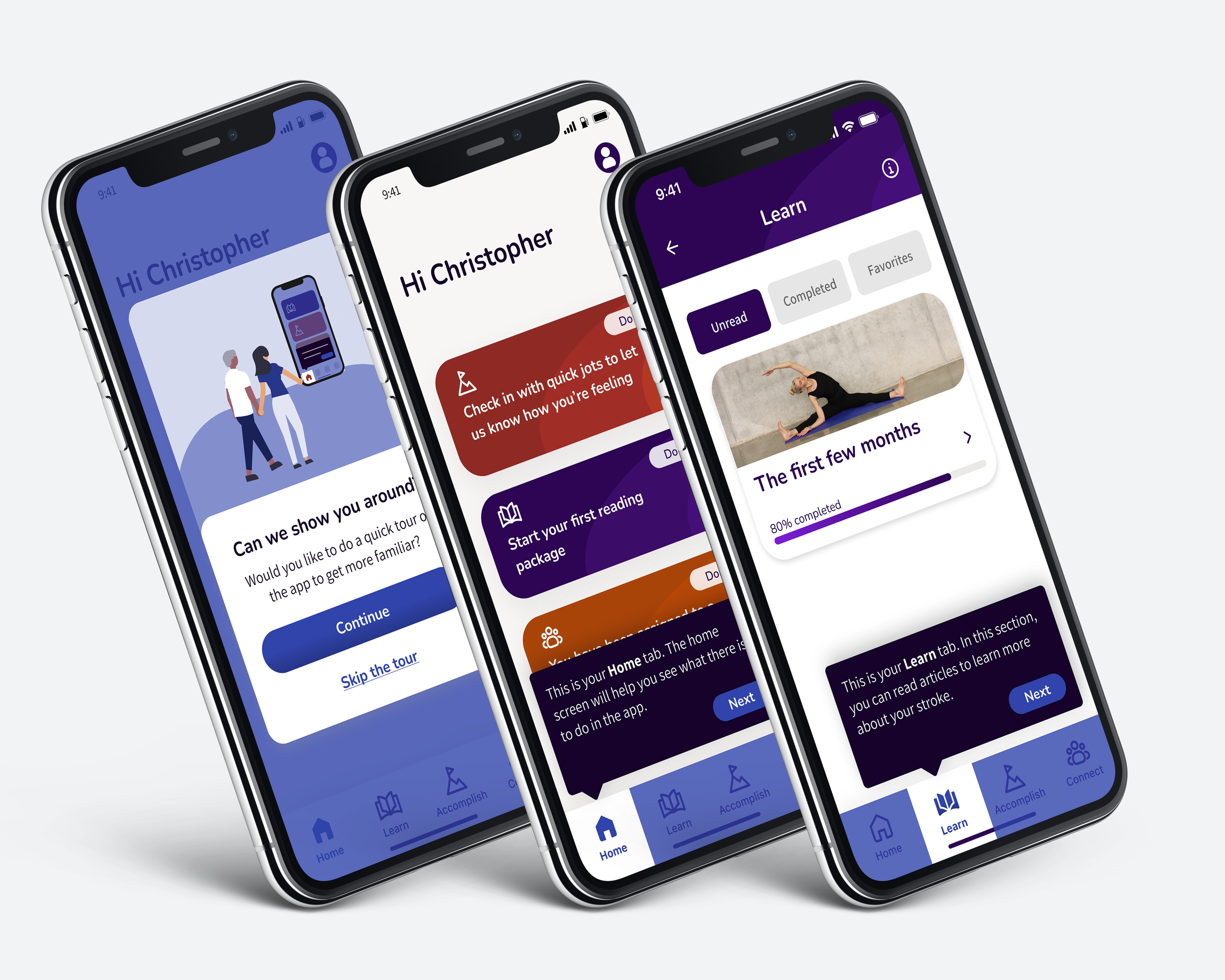
I updated the experience to get the user more immediately into the app (after the redesigned navigator counselor introduction). Prior to this new tour, the user is asked whether they want a product tour to give them the choice. The tour then walks the user through the sections where they are in the real app, pointing to the navigation and previewing the landing pages.
General App Tour Prototype
Homepage Tour Redesign
The introduction to the homepage was originally lumped in with the overall tour before getting into the app.
The actions the screens pointed out (for example “Tap on each card..”) lent themselves to showing the elements in context, but instead they were separated and not shown with the real screens.
I updated this so that the user was introduced to the homepage cards on the screen the first time they went to the homepage instead (after asking if they want the tour), highlighting and pointing to the cards and the card actions.
Learn Tour
Learn, like each section of the app had it’s own first time experience, which started with a series of modals.
To get users into the section without having to go through four modals with text most users wouldn’t read, I updated this to give an option of a tour, then showed the things it was telling about in context of the screens. I also added more guidance based the customer support feedback that users were not clear on the package and article structure, to introduce these elements specifically.
Audio Learning
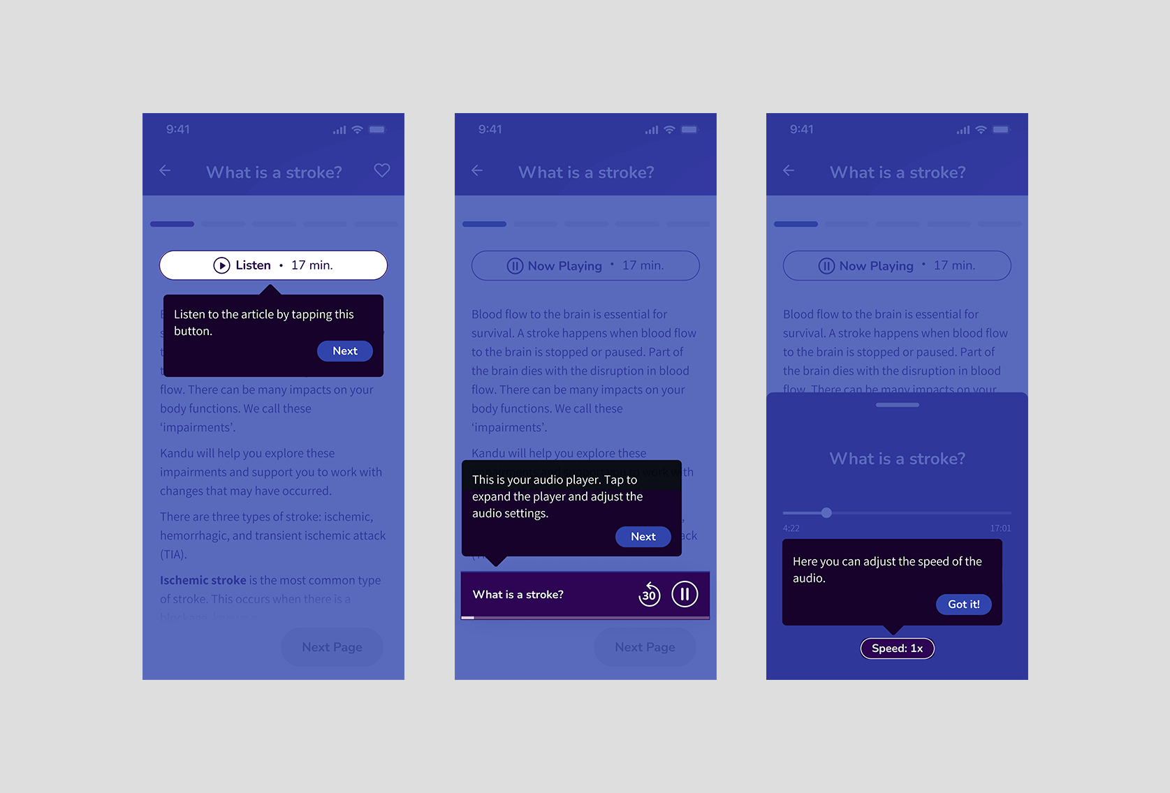
I also added an interactive first time experience for audio learning. In this I made sure to introduce the speed adjustment option, as a function that is particularly useful for stroke survivors and that was not known functionality based on our user surveys.
Connect
Similarly to Learn, the Connect section showed a series of modals when going into a group for the first time. I replaced this again to give an option for the tour and to introduce the elements in context.
Accomplish
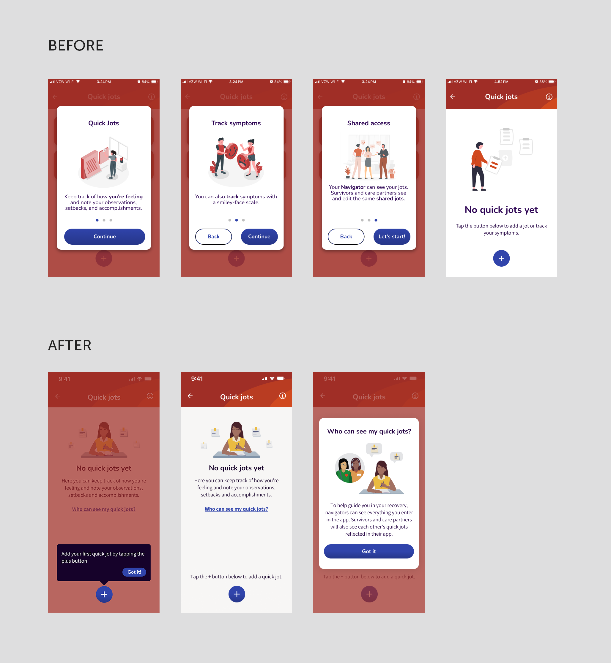
The Accomplish section houses a number of tools to help survivors manage their post stroke recovery (Quick Jots, Questions, To-Do’s, Assessments, and Connect with your Identity). In the original experience, each of these sections started with a series of introduction modals.
For the new experience, I moved text from modals into the empty states, to get the user into the section quicker. The shared information modal became a link to a modal from the empty state, to let the user ask the question vs showing up front as a blocker to the section. For the introduction to adding (adding a quick jot, question, or to-do), I added a tooltip pointing directly to the add button.
This was applied across the sections in the Accomplish section, with variants based on the tools.
