Telemedicine Intake
Project Description
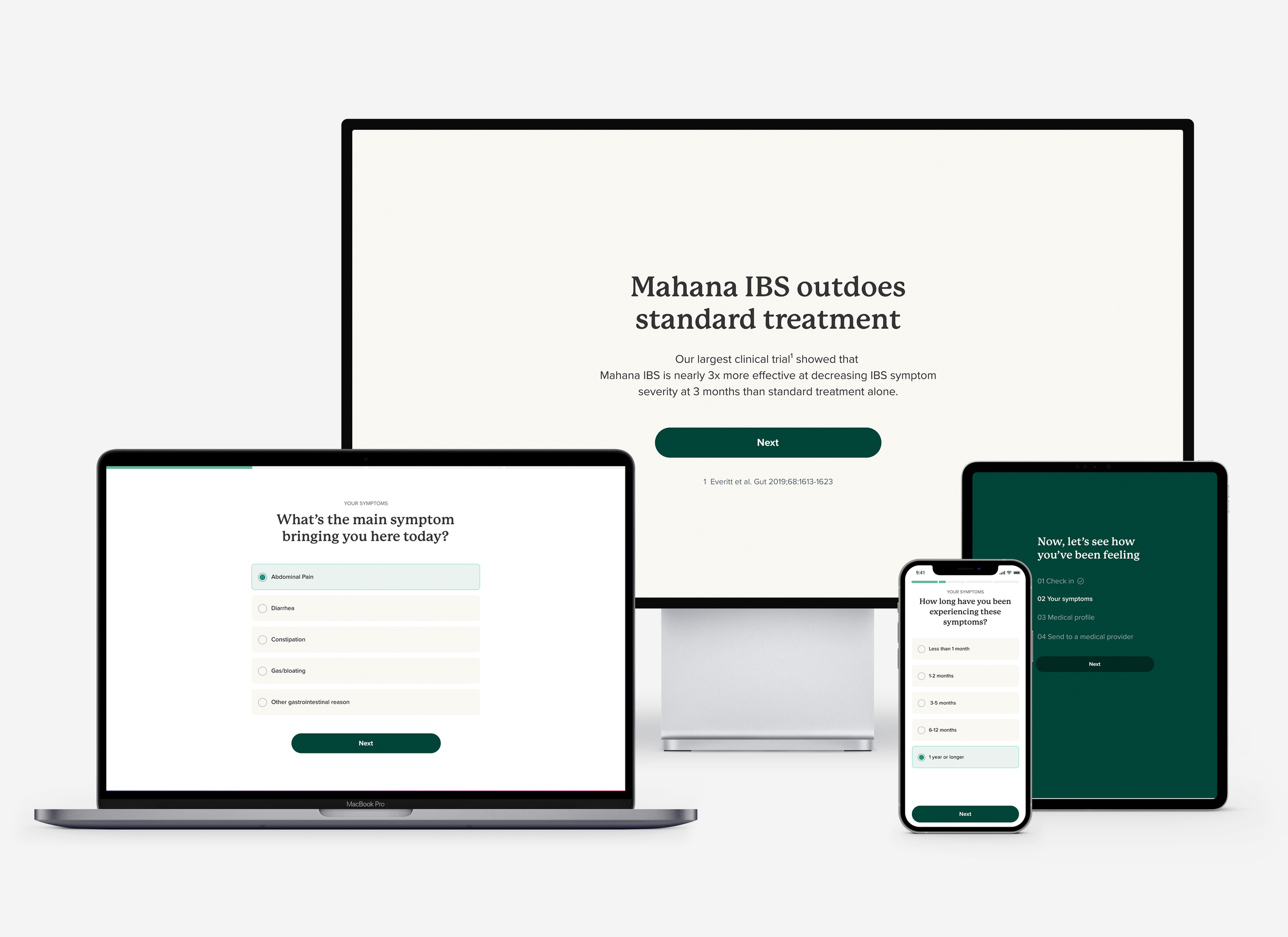
Our goal was to create an experience for patients to complete a remote telemedicine consult to in order to access the full program in the Mahana IBS app.
We needed a digital intake experience to be sent to a doctor who could determine whether they were eligible for a prescription for full app access.
Role
I was involved in the project from the beginning as the design lead. I conducted competitive research, drafted high level user flows for the end to end experience, created concepts and wireframe prototypes for testing, executed the final ui designs and provided Design QA & dev support through implementation.
Discovery/Research Phase
I started the project with the following:
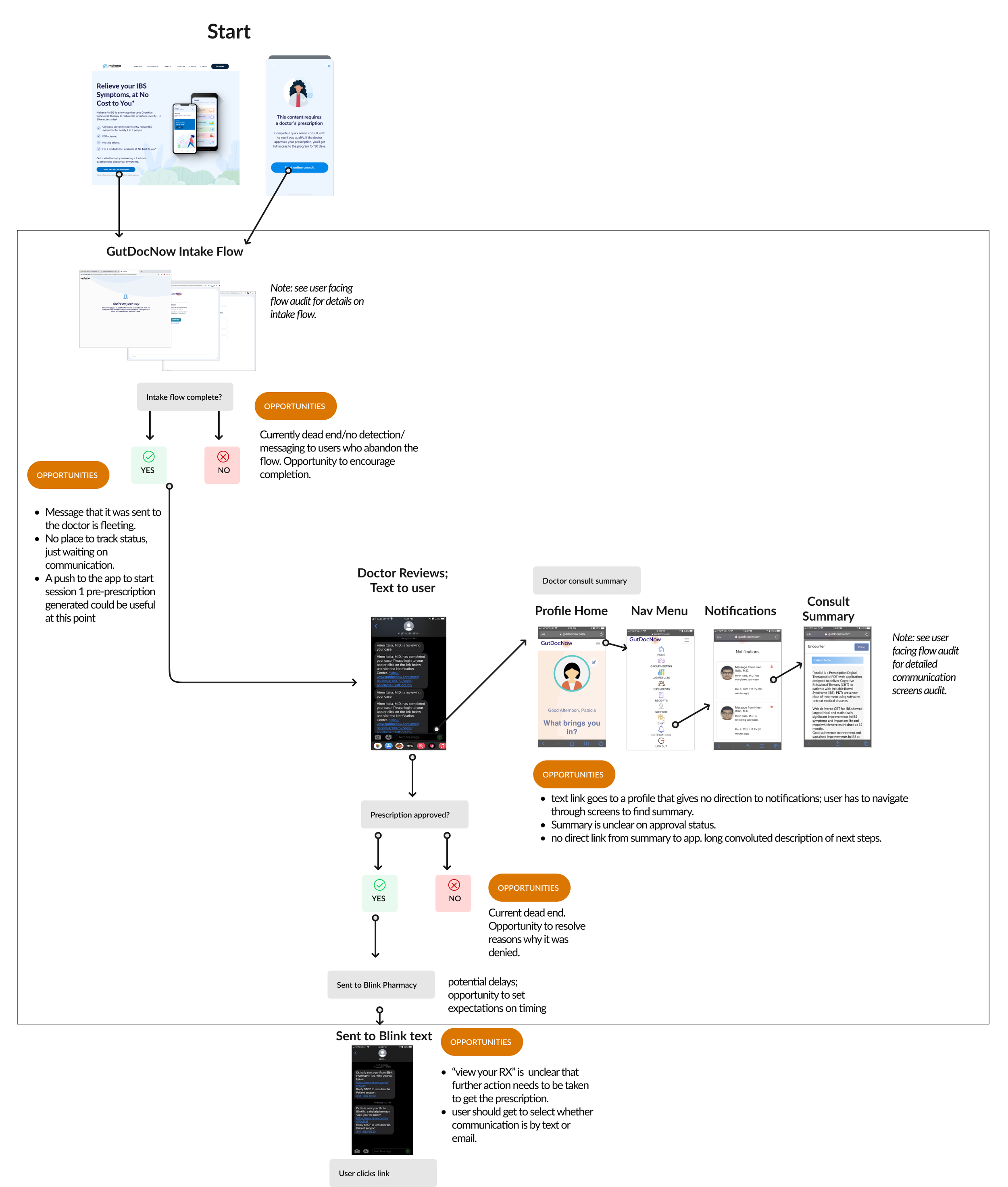
An audit of the existing end to end experience, highlighting opportunities for both near and long term
Review of existing research on the current intake experience
A comprehensive competitive analysis of other intake experiences
Existing Experience Audit


Define & Concept Phase
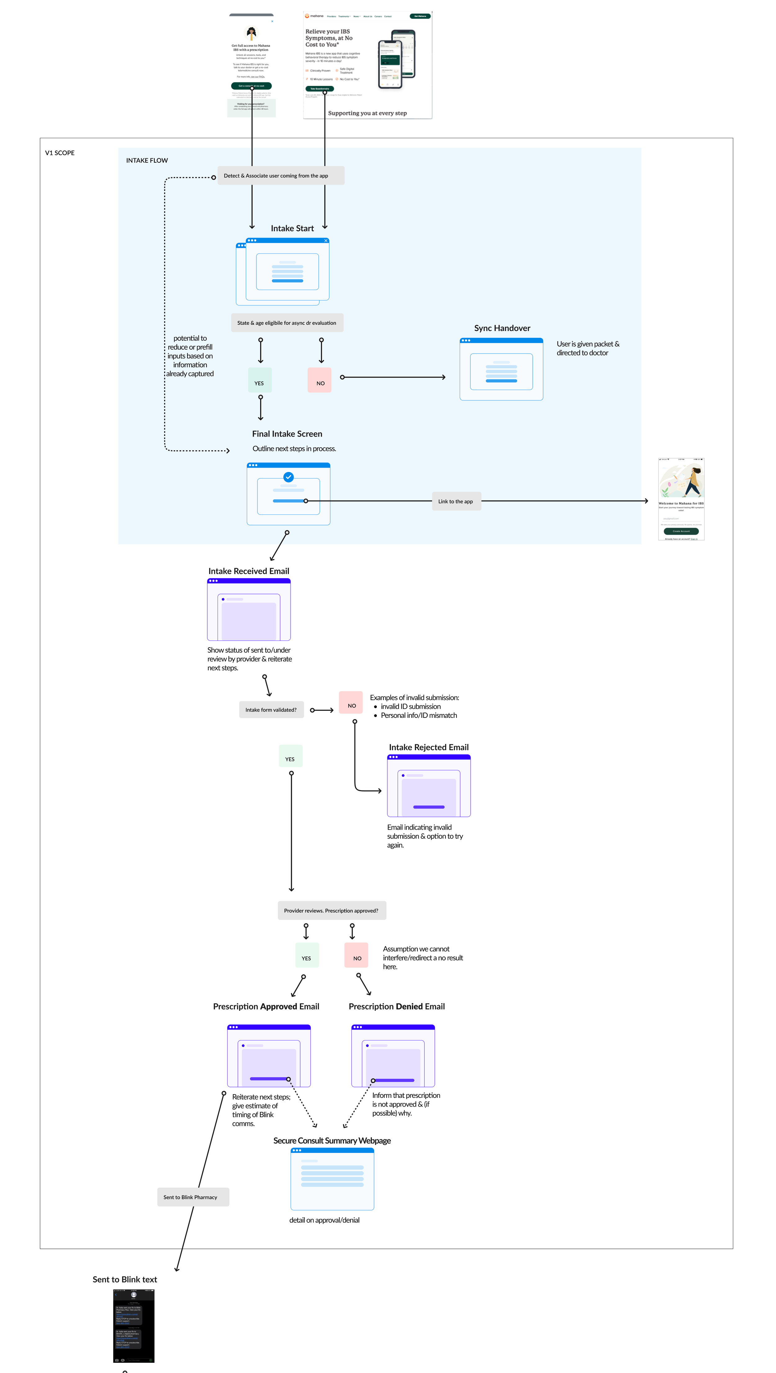
Using learnings from discovery & research and discussing goals and priorities for the launch, I created an updated mapping flow of the new end to end experience.
Proposed Experience Flow for Launch
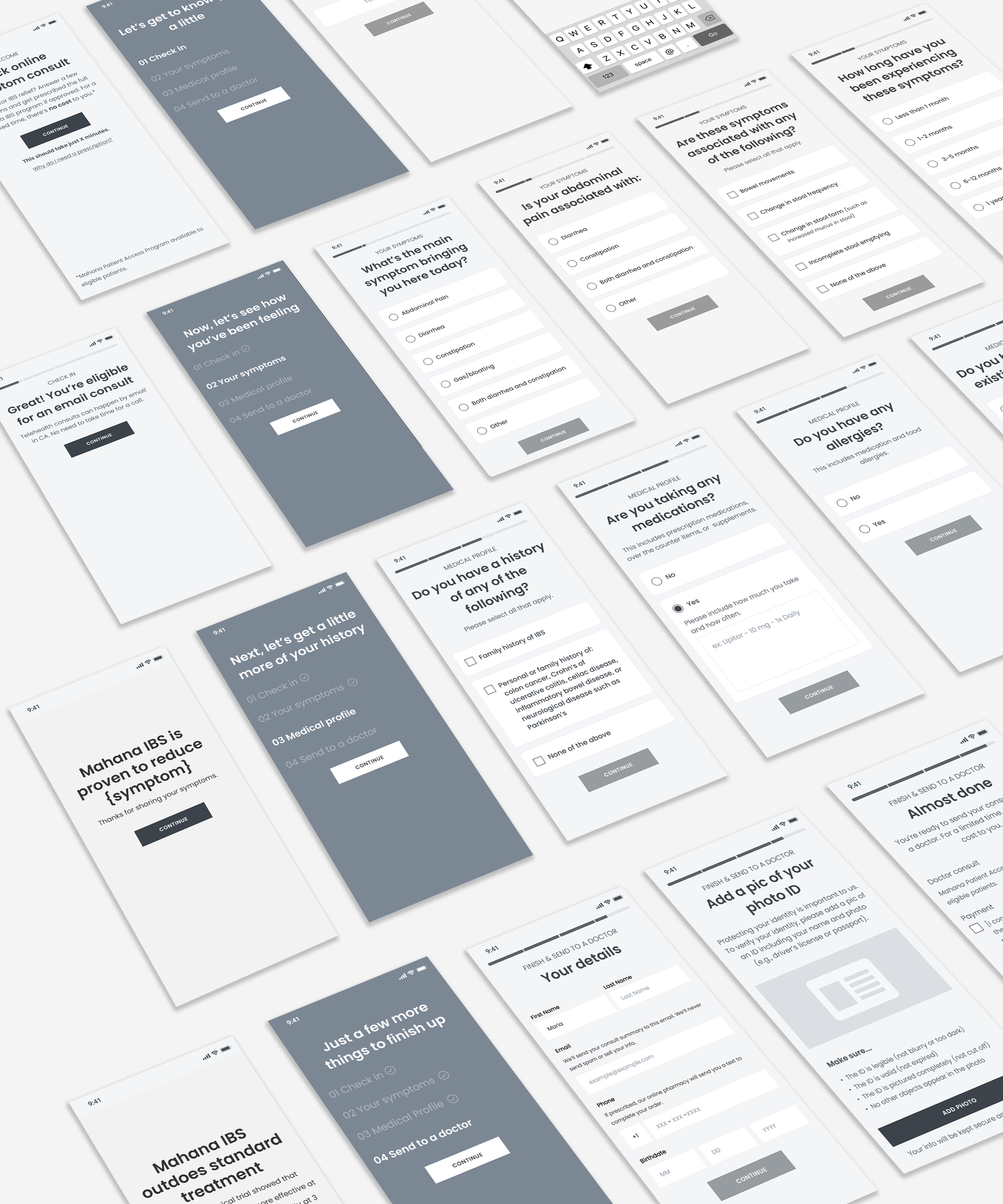
Early Screen Flow Concepts
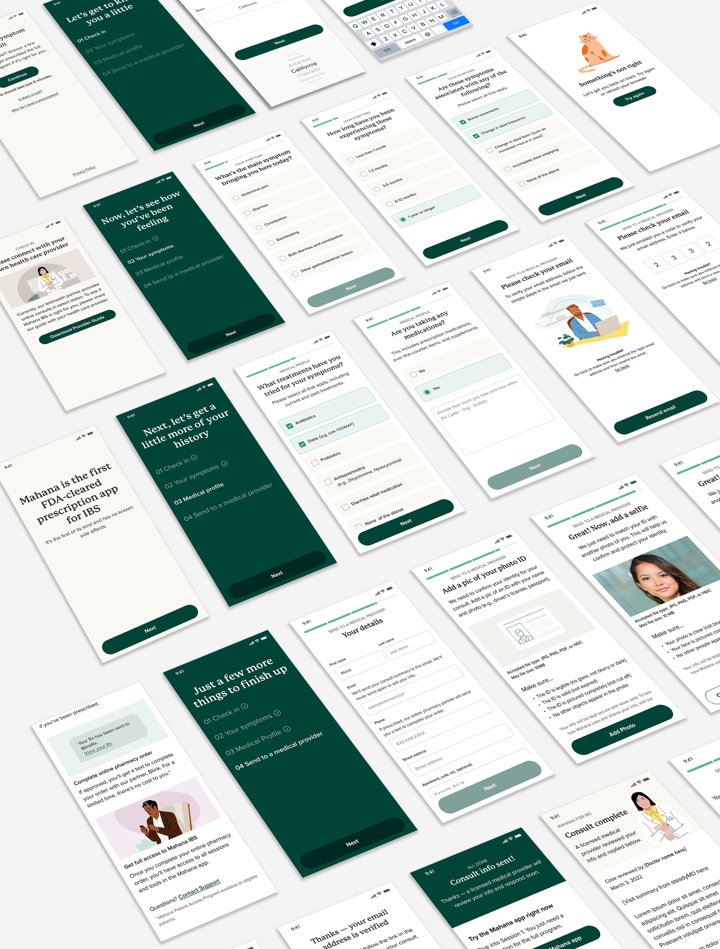
I created early “skamp” concepts so the intake flow & approach could start to take shape. I structured the intake into 4 sections to further guide the user and set clear expectations of where they were in the process:
Check-In
Symptoms
Medical Profile
Personal details & send to provider
Wireframes
The concepts were reviewed and discussed with the team & stakeholders, using the feedback to create wireframes. Working with a content strategist, I crafted the wireframes & a prototype for user testing. As the majority of our users are mobile users, I took a mobile first approach.
Design & Implementation Phases
Finally, integrating the findings from user testing, I created the visual designs. I worked closely with developers to make sure the designs were feasible for implementation along with product stakeholders to ensure we were meeting our product & launch objectives.
During the QA phase, I actively QAed designs and worked with development to ensure we would meet the launch successfully as a team.
Metrics of Success
The success of this redesign can be seen in improvements in conversion.
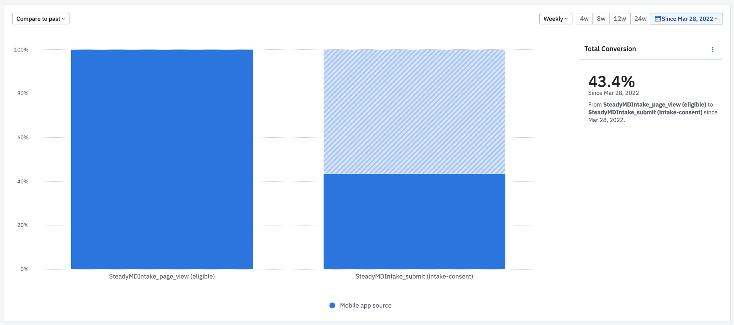
Here’s an example of the submission rate for eligible patients. Note this submission rate reflects traffic from the app (the main traffic source), post the site’s launch in late March.
Minimizing Dropoff in the Beginning
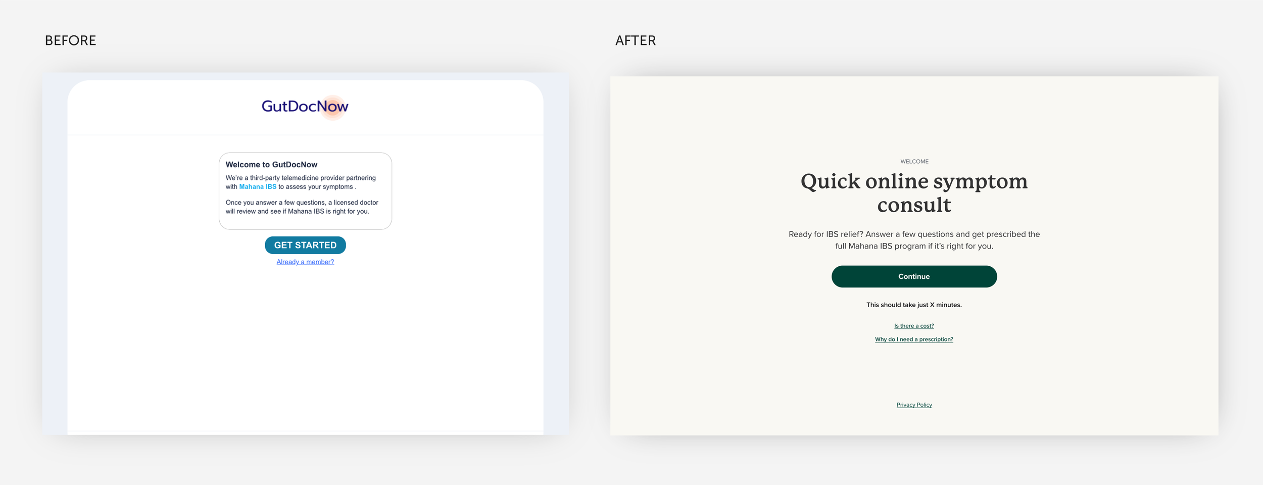
The drop-off rate significantly improved with introducing the new experience. One key area with marked improvement was the introduction page. The original page had a lot of users dropping off, so we made sure to focus on succinctly setting the user’s expectations on the purpose of the consult and addressing key questions that might create hesitancy from the beginning.
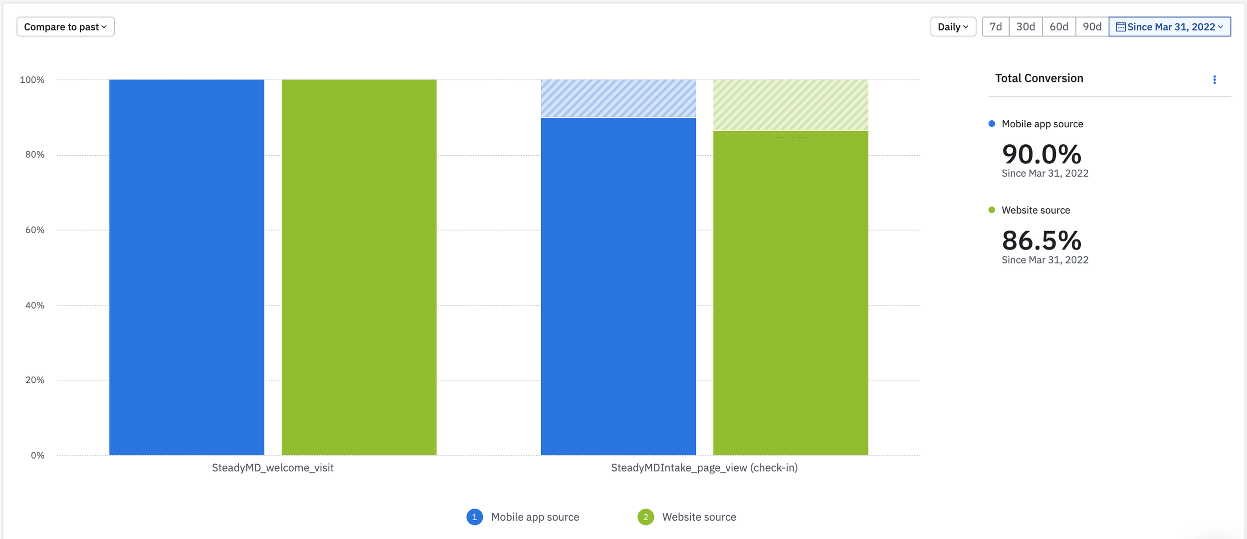
The new introduction screen resulted in most users continuing with the consult. Here are the rates from the intro screen to the second screen for traffic into the flow from the Mahana website and the app.
