Catastrophe Modeling Data Dashboards
Project Description
In this project I was tasked with taking Guy Carpenter’s complex catastrophe modeling reinsurance data and translating the insights into user friendly data visualization dashboards that they could use for their clients.
Role
I was the lead and sole designer on this project. I worked closely with the internal agency business analyst as well as with the client directly. I conceptualized the design from start to finish as well as conducting user research.
Discovery
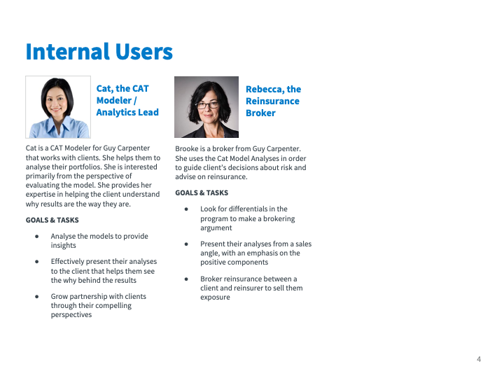
I worked with the client conducting discovery workshops to understand their business goals, audience and user goals, and subject matter background to guide the work. I created an audience analysis & business objectives discovery findings deck.
Discovery Review Deck




Define & Concept
Guy Carpenter was mainly using tabular spreadsheets and wanted visualize them into interactive dashboards to make them easier to understand for their clients as an advisory tool. I worked with the stakeholders and business analyst to understand the data and key performance indicators to be able to visualize the key data stories and structure the dashboards
Here are some of the requirements and use cases we defined:
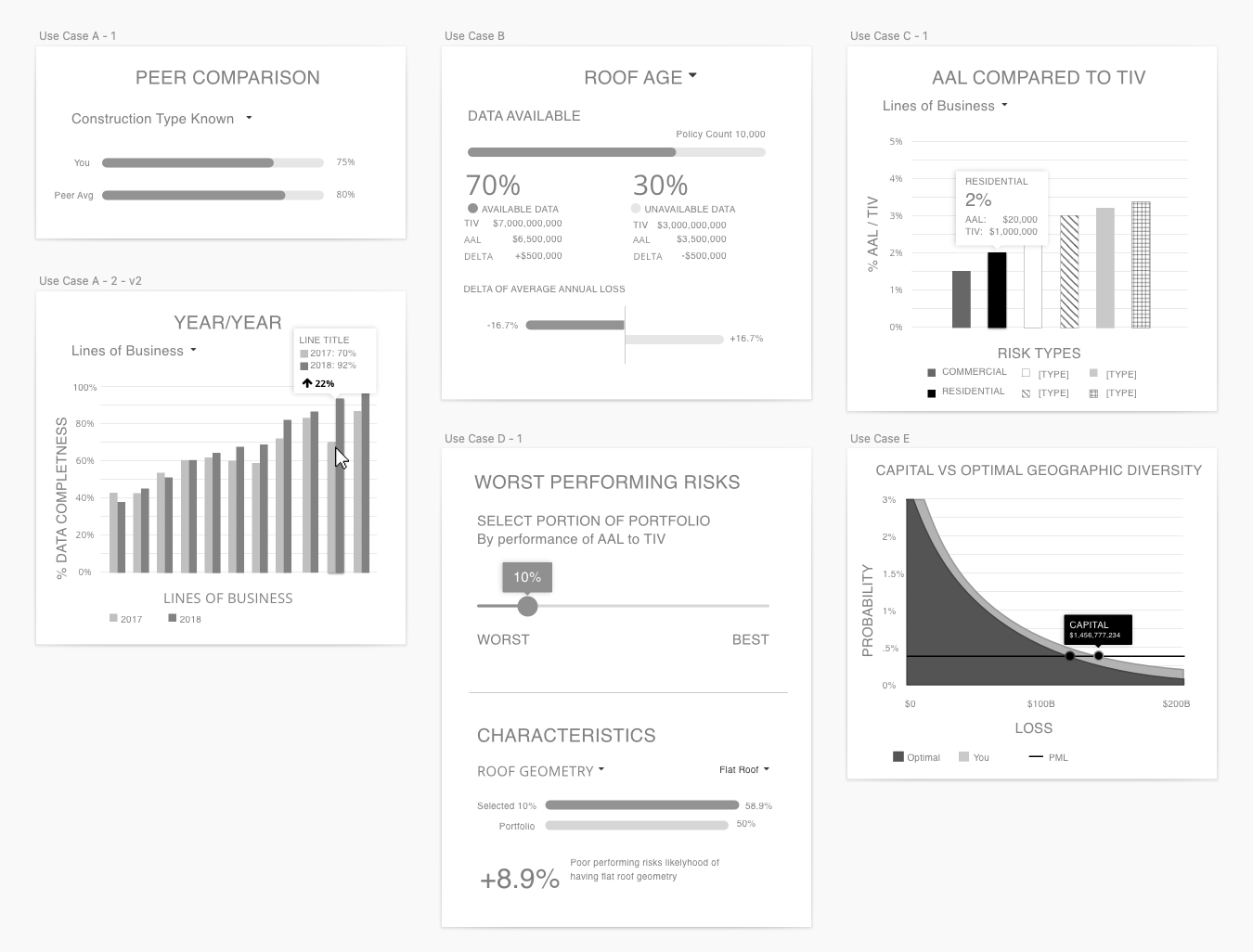
show the client compares to peers on average as well as in various cohorts and characteristics
show different risk characteristic dimensions like peril, region, and line of business
highlight how the data quality changes over time, such as a year over year comparison
give the ability to filter and drill in further to invite clients to engage and consult with Guy Carpenter for further advisory services
Streamlining visualizations
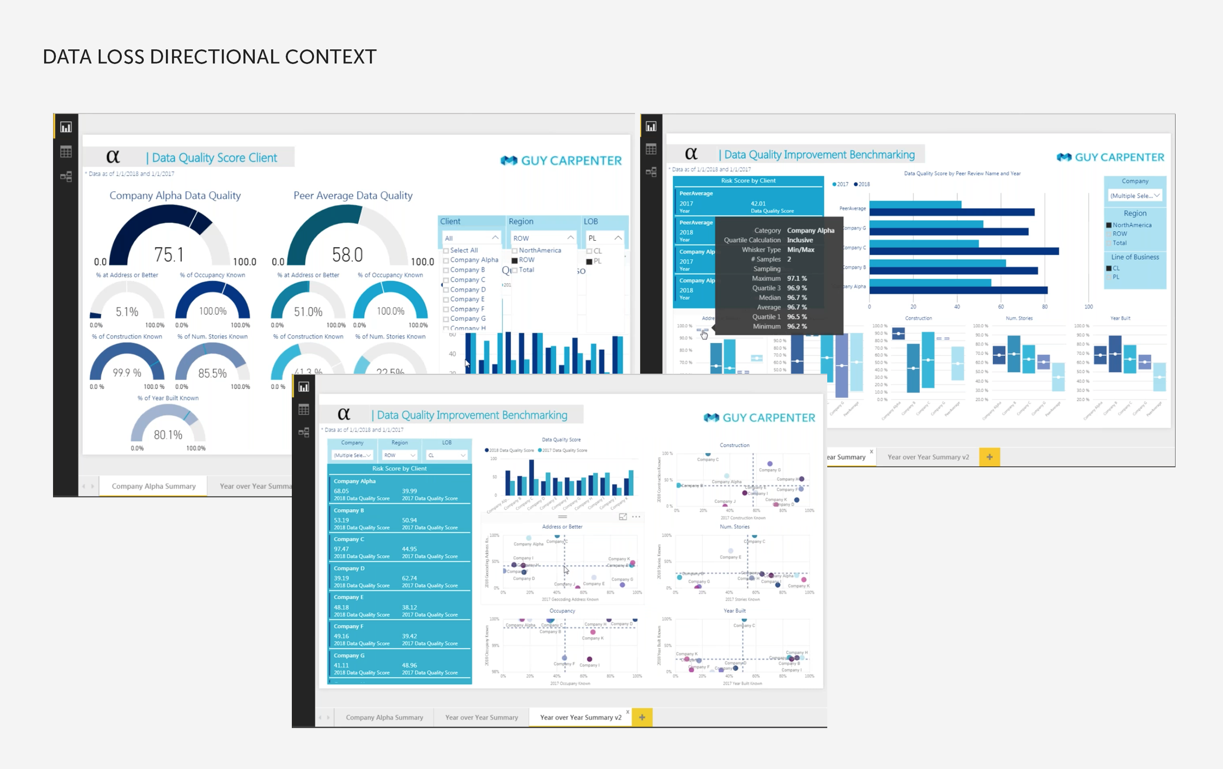
Stakeholders from Guy Carpenter reviewed with us some example explorations for the Data Quality dashboard to help us understand the data they were looking to visualize. They sought our expertise to turn complex data into streamlined dashboards and visualizations.
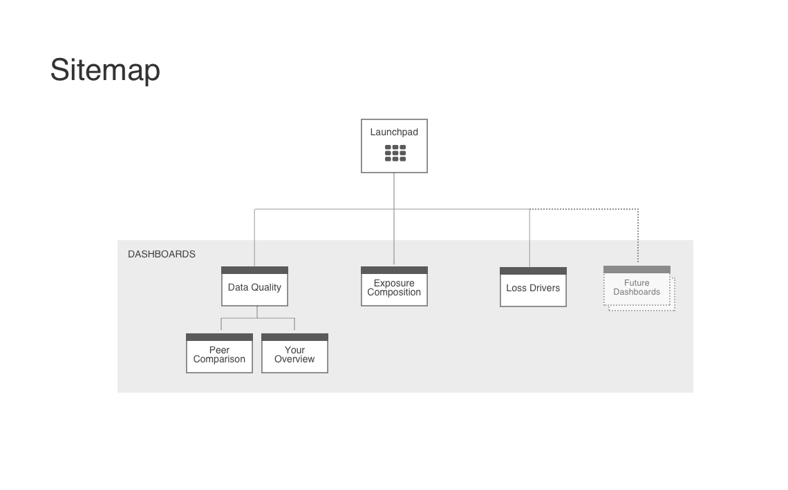
The vision of this was to create 3 initial dashboards with a structure that could be expanded with more in the future. The 3 dashboards were in the following areas of catastrophe modeling risk data:
Data quality
Exposure composition
Loss Drivers
Initial sketches
I began ideating for the data visualization with some low fidelity sketch concepts on the data stories we wanted to communicate.
Wireframes
Initial Wireframes & User Testing
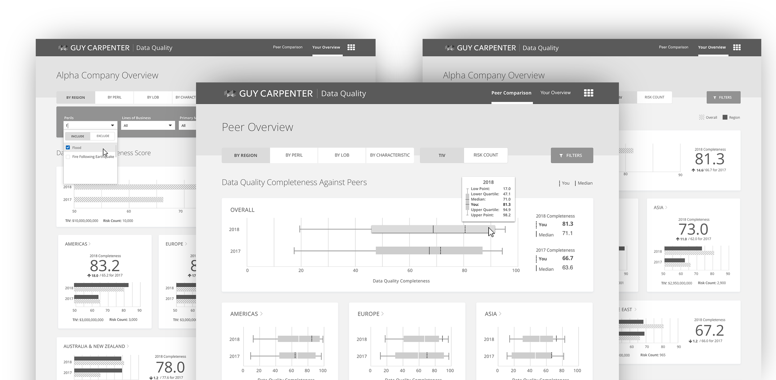
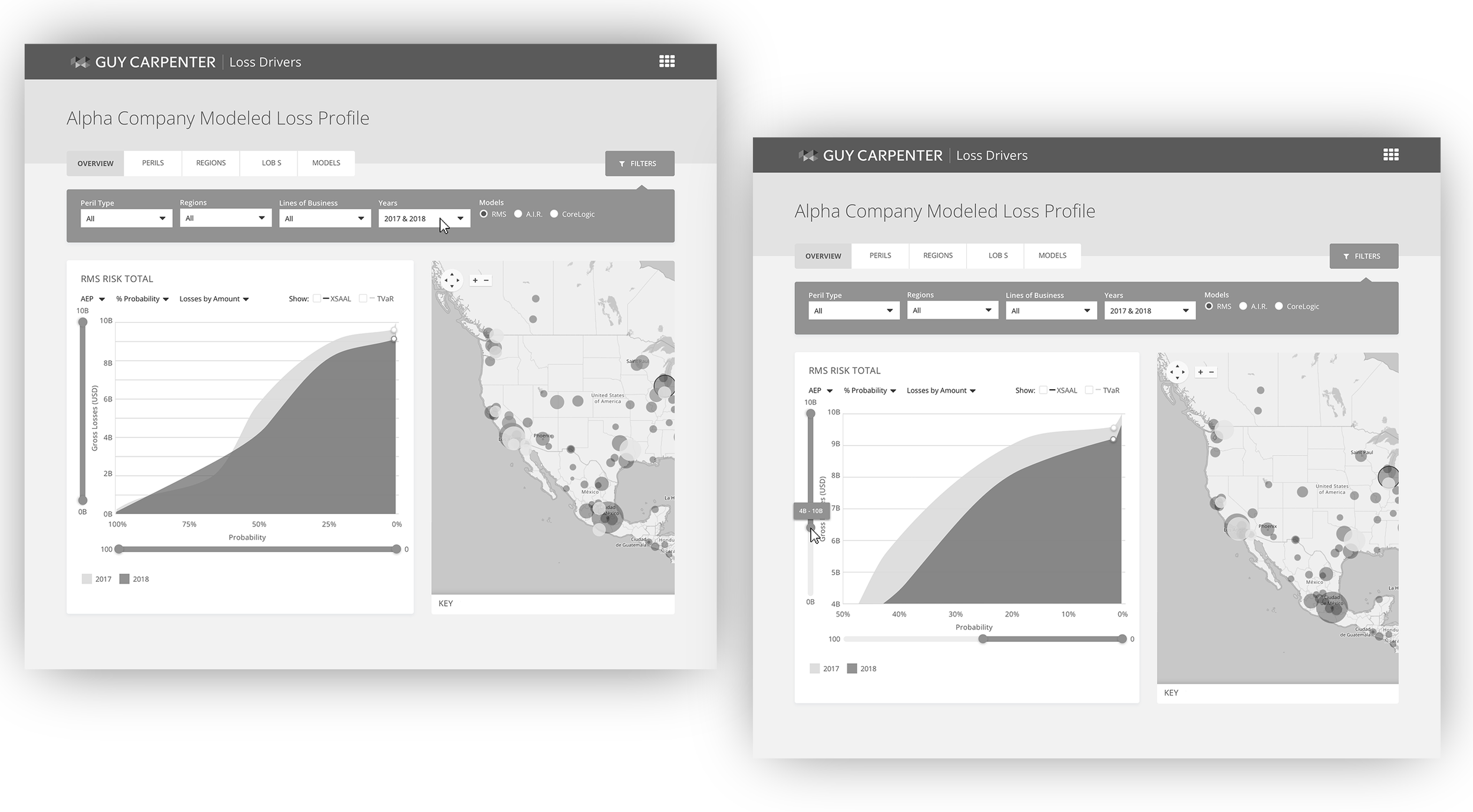
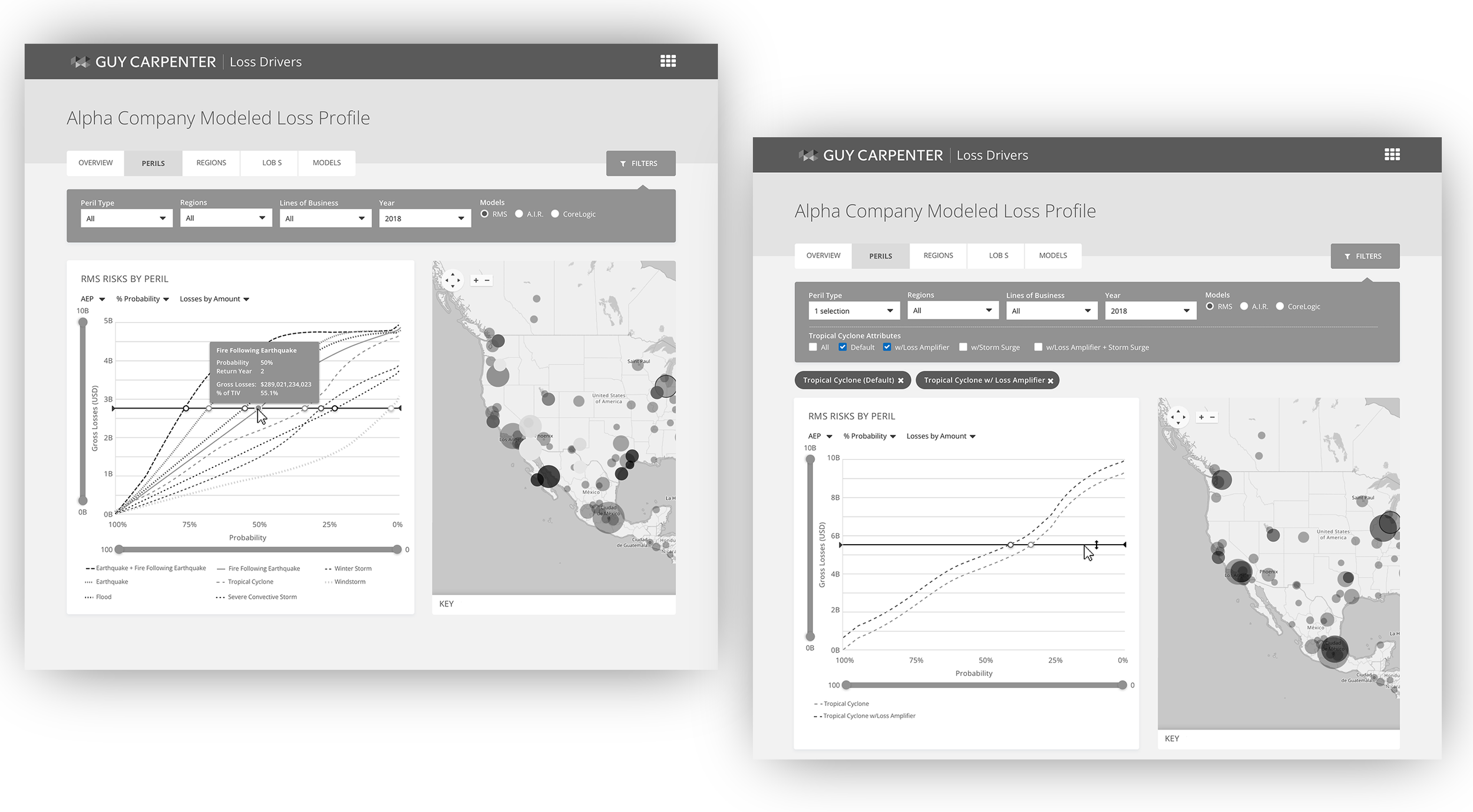
Next, I started to get into the more detailed definition of the dashboards with high fidelity wireframes. This established a structure for the dashboards as well as initial passes at the visualizations.
I reviewed the wireframes with stakeholders and then used them to conduct qualitative user testing interviews and gather user feedback.
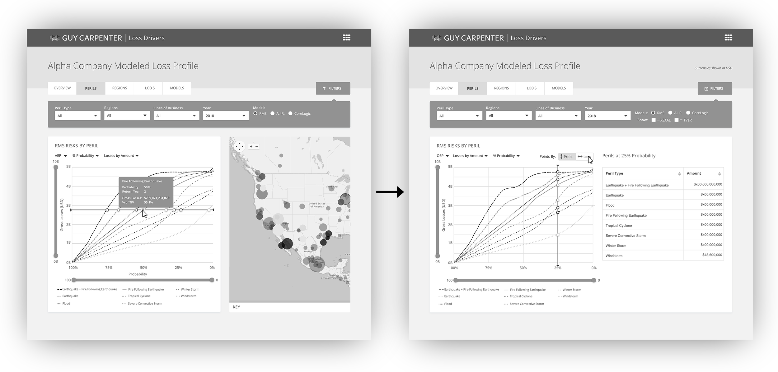
Integrating Feedback
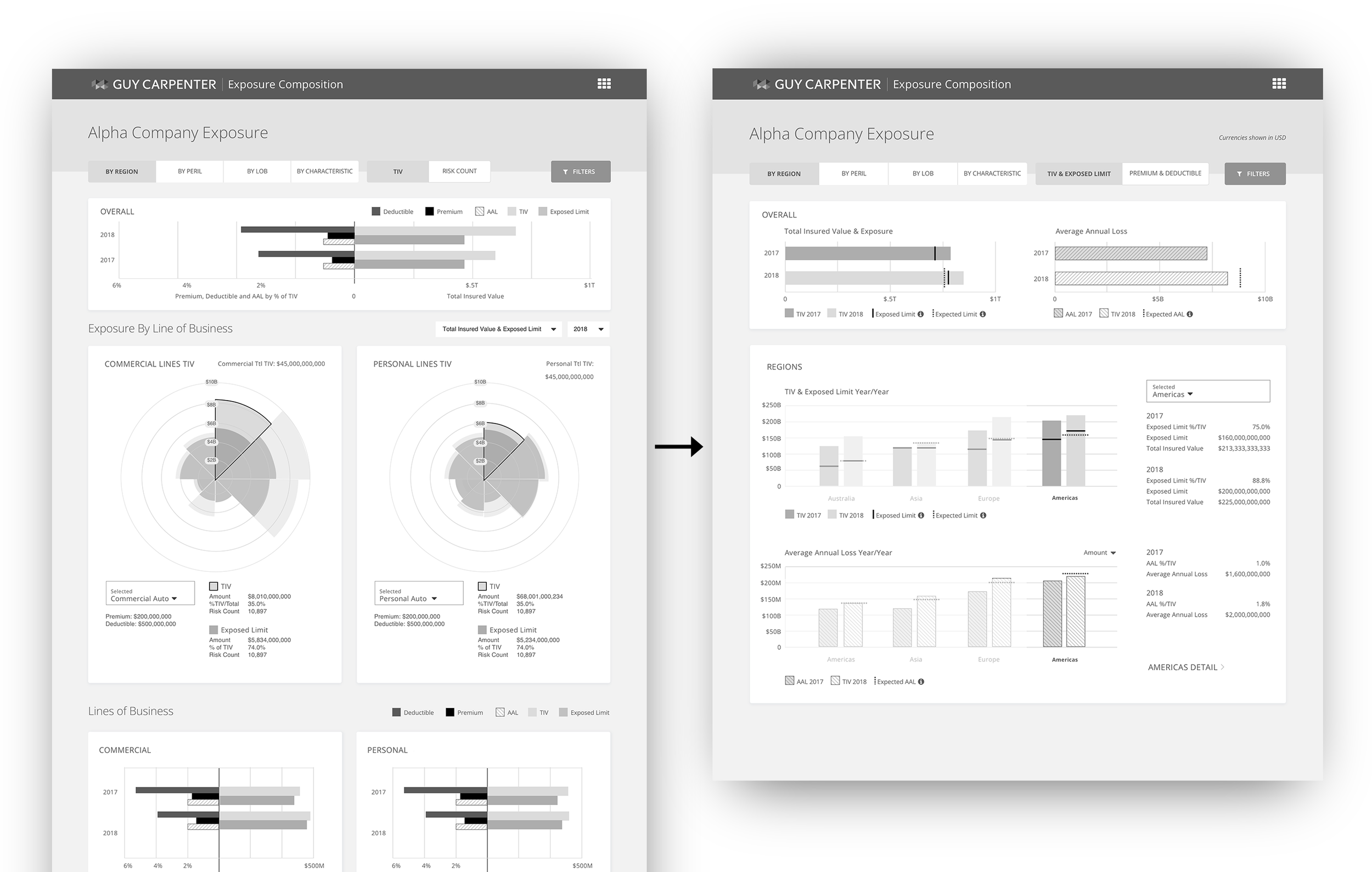
I processed the user feedback and translated it into updates to the wireframes. The biggest area of change was to rethink the nightingale charts. While the nightingale charts were visually impactful and capable of showing multiple dimensions of data at once, they lacked common familiarity that was easily understandable to users. These were updated with a variation on bar charts.
See the final wireframes
Visual Design & Guides
Using the Guy carpenter branding, I applied visual design to the dashboards and visualizations.
Accessible Data Visualization Design
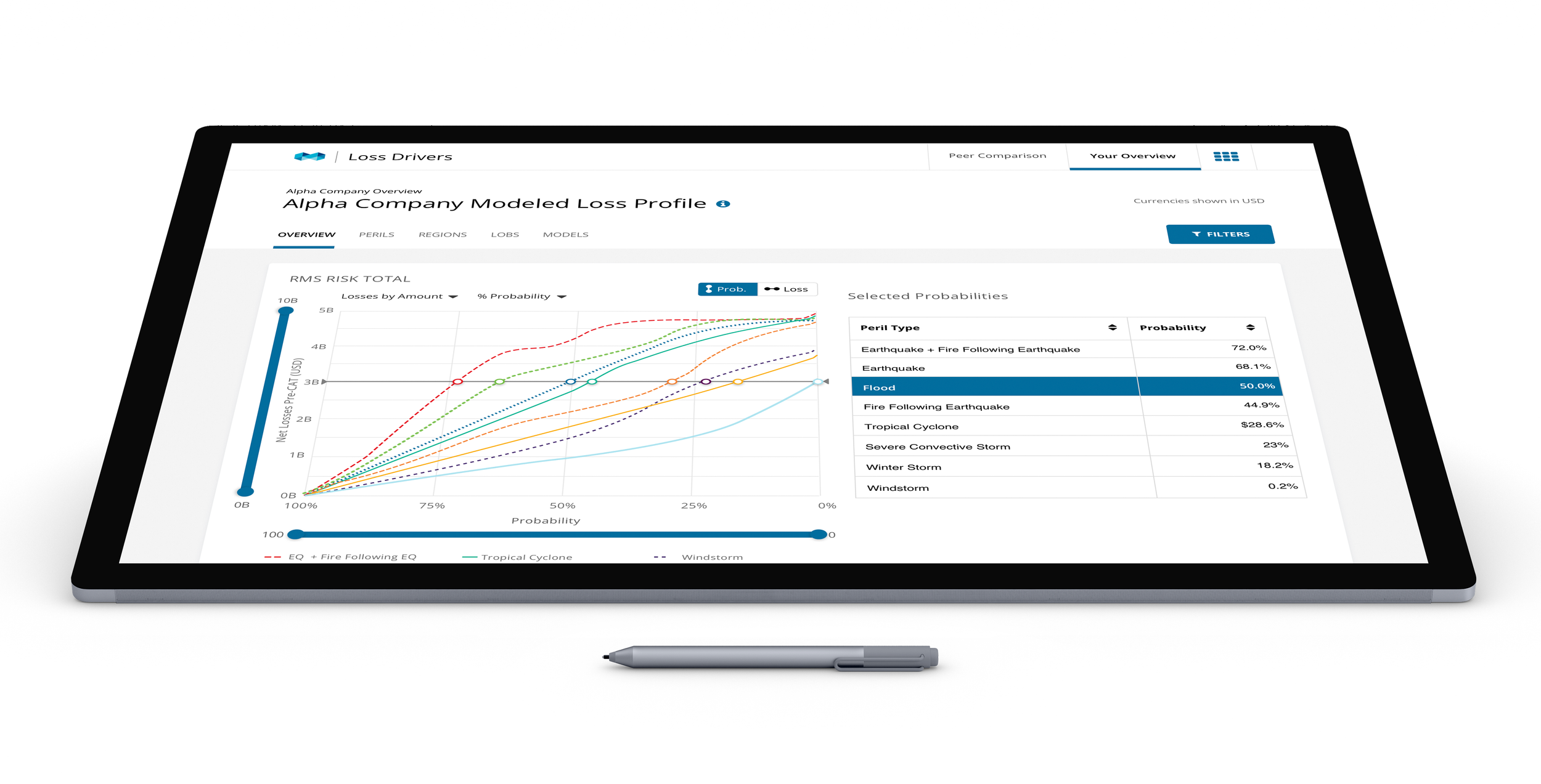
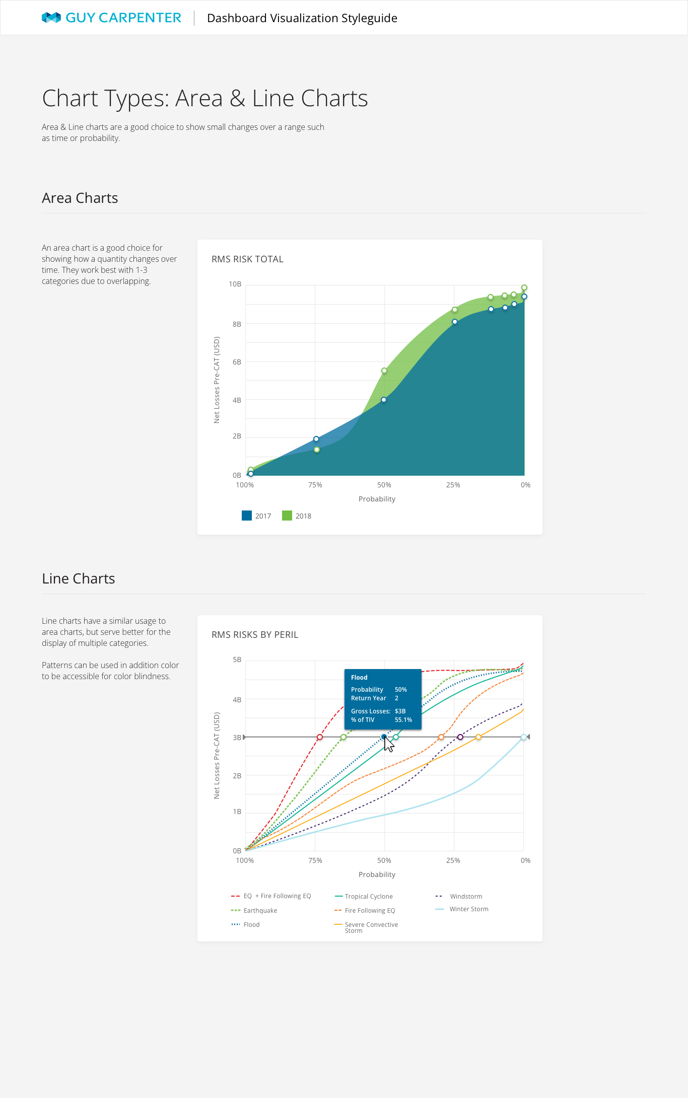
In addition to creating a clean, modern look consistent with the brand, I paid special mind to accessibility for the visualizations. I met WCAG AA contrast for color, but I also tried not to rely solely on color for differentiation. One example of this is in the line graph, which uses a pattern in addition to color.
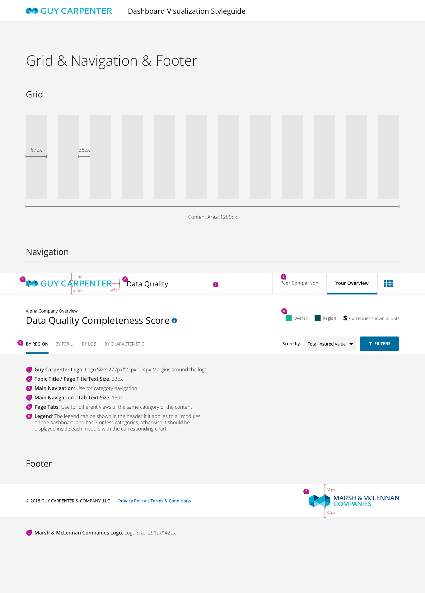
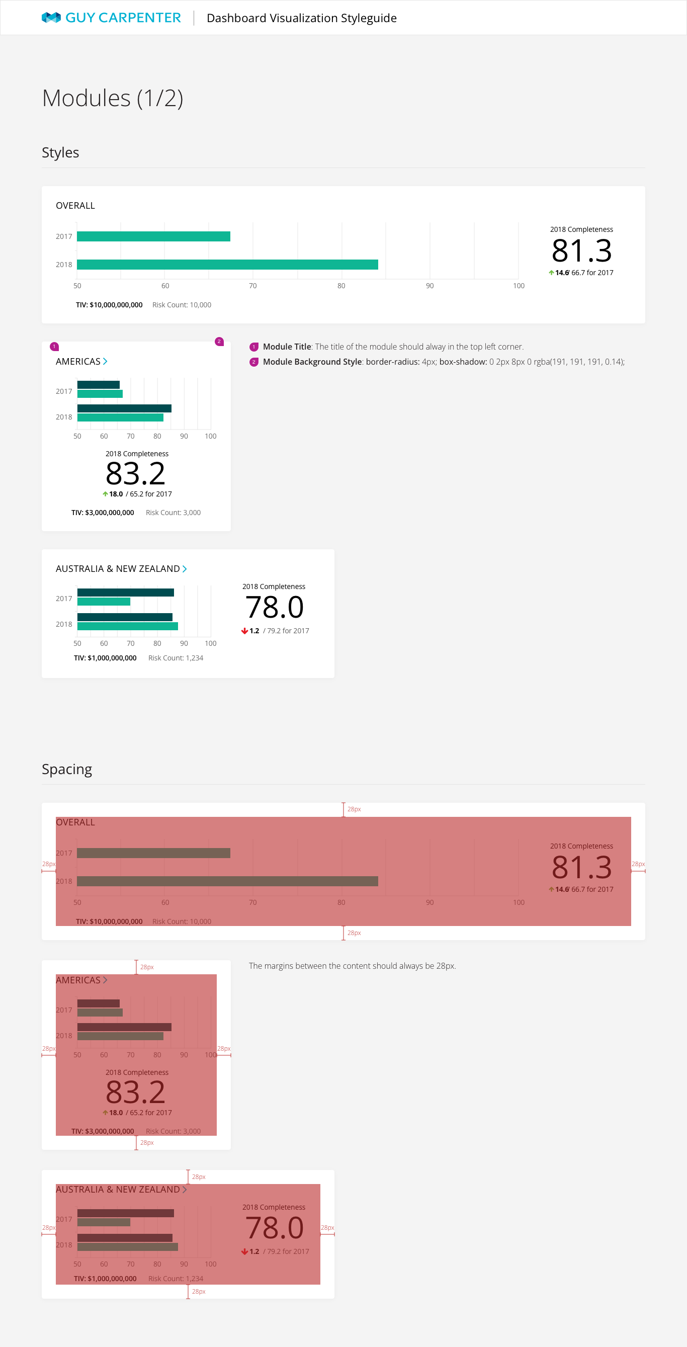
Style & Data Visualization Guide
I created a style guide both for the existing dashboards and so that the design would be able to scale to future dashboards. This included best practice recommendations for data visualization in addition to styles.

